My page is all over the place because I'm in the middle of job interviews (rekt tbh). One of the great things about being a developer is that there are so many different environments I can find myself in - react, vue, angular, they want magento experience, salesforce commerce cloud, marketing cloud, etc. I worked on a refinements angular spa last year, so I figured now is a good time to brush up on my knowledge.
I can't use a production api for my lil' blog, but wanted to recreate the refinements app using some free api out there. Testing with the cat api for now since it's free. It's not the same type of filters I worked on previously (hotels), but I can't find a decent free hotels api.
So, a n g u l a r. Let's install it. Follow these steps to install angular/cli, bootstrap, create a project, and then run it locally.
Note: npm i is the same as npm install :)
jsnpm i -g @angular/cling new project-namecd project-namenpm i bootstrapng serve
Within angular.json, add the bootstrap.min.css file.
JSON"styles": ["node_modules/bootstrap/dist/css/bootstrap.min.css","src/styles.css"],
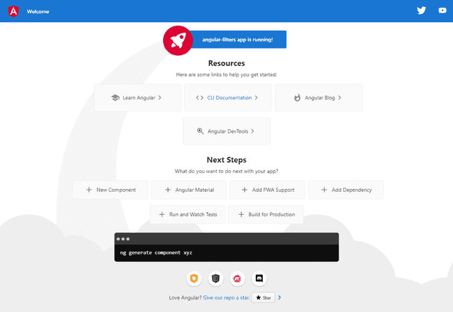
Your site will load on localhost:4200 and look like this:

Delete everything within app.component.html, we don't need any of it.
We want to create a new component for the filter-bar and use it within the app.component.html file. Creating components with angular is easy, just run the following command:
terminalng g c component-name// in this case, component-name is filter-bar for this project.
This will automatically create a folder called filter-bar with the css,html, and ts files.
Note: ng g c is a short cut for ng generate component #themoreyouknow
Add the remaining components for now:
terminalng g c filter-bar/filter-bar-itemsng g c product
Within app.component.html, let's add <app-filter-bar></app-filter-bar> to import the new filter-bar component.I'm using main as part of my accessibility best practices. (semantic html :p)
Note: mt-5, container, row, and col-md-** are bootstrap classes.
html<main class="container mt-5"><main class="container row mt-5"><aside class="filters col-md-3"><app-filter-bar></app-filter-bar></aside><section class="product col-md-9"><app-product></app-product></section></main></main>
You should see a message that says filter-bar works! on your local host page.
Within the filter-bar.component.html, let's delete everything and add the filter-bar and items. I'm using BEM as my naming structure for my css classes. I covered it here
html<h1 class="h6">Filters</h1><ul class="filters__list is--list"><app-filter-bar-items></app-filter-bar-items></ul>
The filter-bar-items.component.html should look like this. I created a gist for filter-bar-items.component.css.
html<li class="filters__list-item"><button class="button button-toggle" type="button" data-bs-toggle="collapse" data-bs-target="#category" aria-expanded="false" aria-controls="category">Category</button><div class="filters__collapse"><ul class="filters__options is--list"><li><label class="custom-checkbox"><input type="checkbox"><span class="checkmark"></span>Tote</label></li><li><label class="custom-checkbox"><input type="checkbox"><span class="checkmark"></span>Satchel</label></li></ul></div></li><li class="filters__list-item"><button class="button button-toggle" type="button" data-bs-toggle="collapse" data-bs-target="#color" aria-expanded="false" aria-controls="color">Color</button><div class="filters__collapse"><ul class="filters__options filters__options--colors is--list"><li><label class="custom-checkbox"><input type="checkbox"><span class="checkmark checkmark--color is--red"></span><span class="sr-only">red</span></label></li><li><label class="custom-checkbox"><input type="checkbox"><span class="checkmark checkmark--color is--green"></span><span class="sr-only">green</span></label></li><li><label class="custom-checkbox"><input type="checkbox"><span class="checkmark checkmark--color is--blue"></span><span class="sr-only">blue</span></label></li></ul></div></li><li class="filters__list-item"><button class="button button-toggle" type="button" data-bs-toggle="collapse" data-bs-target="#price" aria-expanded="false" aria-controls="price">Price</button><div class="filters__collapse"><ul class="filters__options is--list"><li><label class="custom-checkbox"><input type="checkbox"><span class="checkmark"></span>Less than $100</label></li><li><label class="custom-checkbox"><input type="checkbox"><span class="checkmark"></span>$100 - $250</label></li><li><label class="custom-checkbox"><input type="checkbox"><span class="checkmark"></span>Over $250</label></li></ul></div></li>
The product.component.html should look like this. Attaching gist for styling.
html<ul class="product__list row is--list"><li class="col-md-3"><img src="" class="img-responsive product__list-img"><h2 class="h6 product__list-name">Item</h2><p class="product__list-price">$101</p></li><li class="col-md-3"><img src="" class="img-responsive product__list-img"><h2 class="h6 product__list-name">Item</h2><p class="product__list-price">$101</p></li><li class="col-md-3"><img src="" class="img-responsive product__list-img"><h2 class="h6 product__list-name">Item</h2><p class="product__list-price">$101</p></li><li class="col-md-3"><img src="" class="img-responsive product__list-img"><h2 class="h6 product__list-name">Item</h2><p class="product__list-price">$101</p></li></ul>
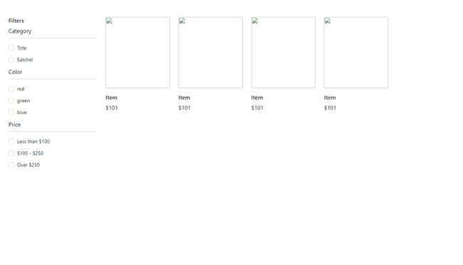
Your localhost site should look like this. Next steps - creating events, setting up the cat api, and models. I'll also update the section that holds the colors filter. It's FUN FOR THE WHOLE FAMILY.
